
Communicating with existing and potential customers is more important than ever right now. They don't…
Why Fonts Matter in Marketing
In the world of marketing, it’s all about the presentation. A huge part of any piece of marketing are the words that it includes and the message it sends. How you say something is as important as what you say. Let’s take a look at why fonts matter in marketing.
Fonts are an often-overlooked brand component. This is a grave mistake because fonts represent a powerful, recurring communication tool. Why not use something that stands readily at your disposal?
And it’s not just about mere surface of aesthetics. Reasons why fonts matter are deep-seated and multi-fold.
Namely, they constitute everyday points of contact between brands and customers. Operating on various subtle and subliminal levels, they shape people’s perceptions of your company.
The Devil is in the Detail
Mastering the art of visual communication is the key to making your message resonate.
This is because aesthetics tend to evoke emotions and show intent. They convey complex ideas near-instantaneously, setting the tone for the interaction. This communication immediacy is paramount in an oversaturated marketing realm, where consumers exhibit attention spans.
Like it or not, you need to be more personal and detail-oriented than ever before. The chief challenge is learning how to guide the eye and direct attention.
You don’t have to take our word for it. Psychological studies confirm there’s a conglomerate of mental processes that occur when marketing messages and content are consumed. Typeface ties right into these processes in a way that is vital for modern brands.
It allows you to make a strong first impression and successfully retain attention. We all know how vital these things are in creating successful marketing campaigns and reaching business goals.
A Vast Spectrum of Choice
The problem that marketers face is obvious.
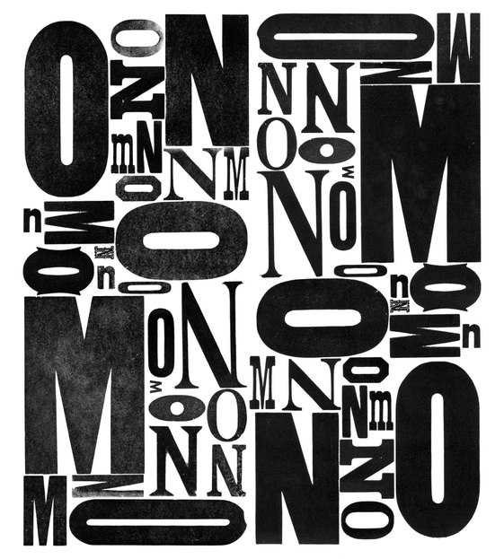
There are thousands and thousands of fonts to choose from. How do you cherry-pick the best one? Well, let’s give you some surefire tips to make things easier for you.
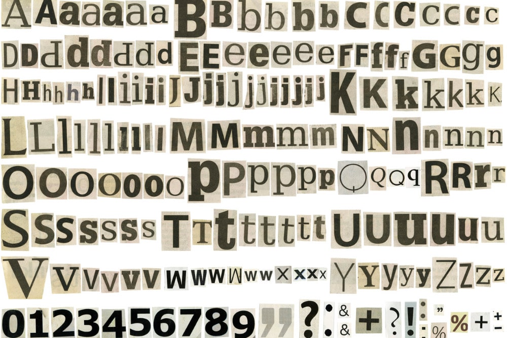
First off, take the example of Serif Fonts, the bread and butter of countless marketing campaigns. They contain pinches of visual flair at their tips, igniting a reader’s attention. At the same time, they echo norms because they are integral parts of the marketing establishment.
You can hardly go wrong with this sublime combo of style and substance, which doesn’t say you absolutely should. There are more innovative and out-of-the-box ideas to also think about.
Script and handwriting fonts, for instance, add a nice twist. They look elegant enough to fit the contemporary design mold and are easy on the eyes too.
On the other hand, display fonts, such as Lobster, take a bolder approach. They arrest attention right away, which is why they’re used for headlines and sometimes logos.
This brings us to a crucial point of not going overboard. In today’s marketing landscape, less is often more. Or to put it this way: Simplicity represents some form of sophistication.
You want to make reading less taxing and more enticing in one stroke.
Playing it by the Book
Another basic rule is to set your own preferences aside.
Instead of relying on them, use your target audience as a guiding light. Investigate how your ideal buyers view, interact with, and judge your content.
When in doubt, go for a more readable option, which enhances the user experience. In the case of online campaigns, this move decreases bounce rates and maximizes engagement. Similar benefits kick in when designing readable print material.
Furthermore, make sure the font is consistent with your message.
Playful fonts get in the way of getting a serious point across. Naturally, they do the exact opposite for fun and whimsical topics.
Once you select the font, examine how it plays out with the rest of the environment. There should be the right contrast with the background to facilitate reading. Black text on a white background is a classic you can stick to – dark grey on white also works well and is a bit softer.
Then, there’s a matter of size and spacing. There are just a few hard rules to follow here. Don’t make your fonts too big, as it looks borderline cartoonish. Too small isn’t any good either.
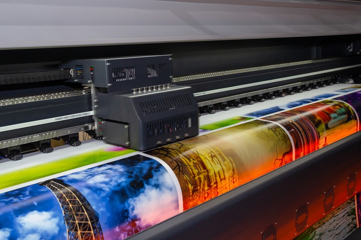
Exact size and spacing depend on the dimensions of material you’re working with. Wide-format printing on banners and posters give you more room to play around with sizes than flyers and brochures.
Finishing Touches
Finally, it goes without saying that you need to show consistency across marketing collateral.
A bunch of different fonts only send mixed signals and give rise to brand confusion. Avoid this mess at all costs.
Yes, there’ll be some situations in which you aren’t offered many choices. When that happens, opt of the next best thing (the most similar font). Likewise, use as few different typefaces as possible.
Oh, and you should remember there are no one-size-fits-all solutions. Just because some solutions work for industry leaders doesn’t mean they’re the right option for you.
After all, fonts are used across content formats, industry sectors, and marketing campaigns. Therefore, always factor in the context and the communication channel you’re using. What makes sense for a social media ad might not cut it for a company flyer.
Feel free to experiment a bit. It takes some trial and error to figure things out. No need to rush such an impactful decision.
You Now Know Why Fonts Matter— Time to Act
The question of why fonts matter has multiple answers.
Nevertheless, they all tell you the same thing: don’t let fonts be an afterthought. They make a profound impression.
You could say they’re crown jewels of your brand’s visual identity. They need to shine but not blinding to potential customers and clients.
So, take into account the rest of your marketing and brand assets. Find the most optimal type, size, and color. Weigh the pros and cons of different solutions before committing to one.
Keep things simple and in line with your mission and goals. Amplify your core messages and drive engagement. This is a way to connect with the audience on a deeper level and establish trust.
Check out our printing and direct mail services if you want to supercharge your campaigns.
Related Posts

This Post Has 0 Comments